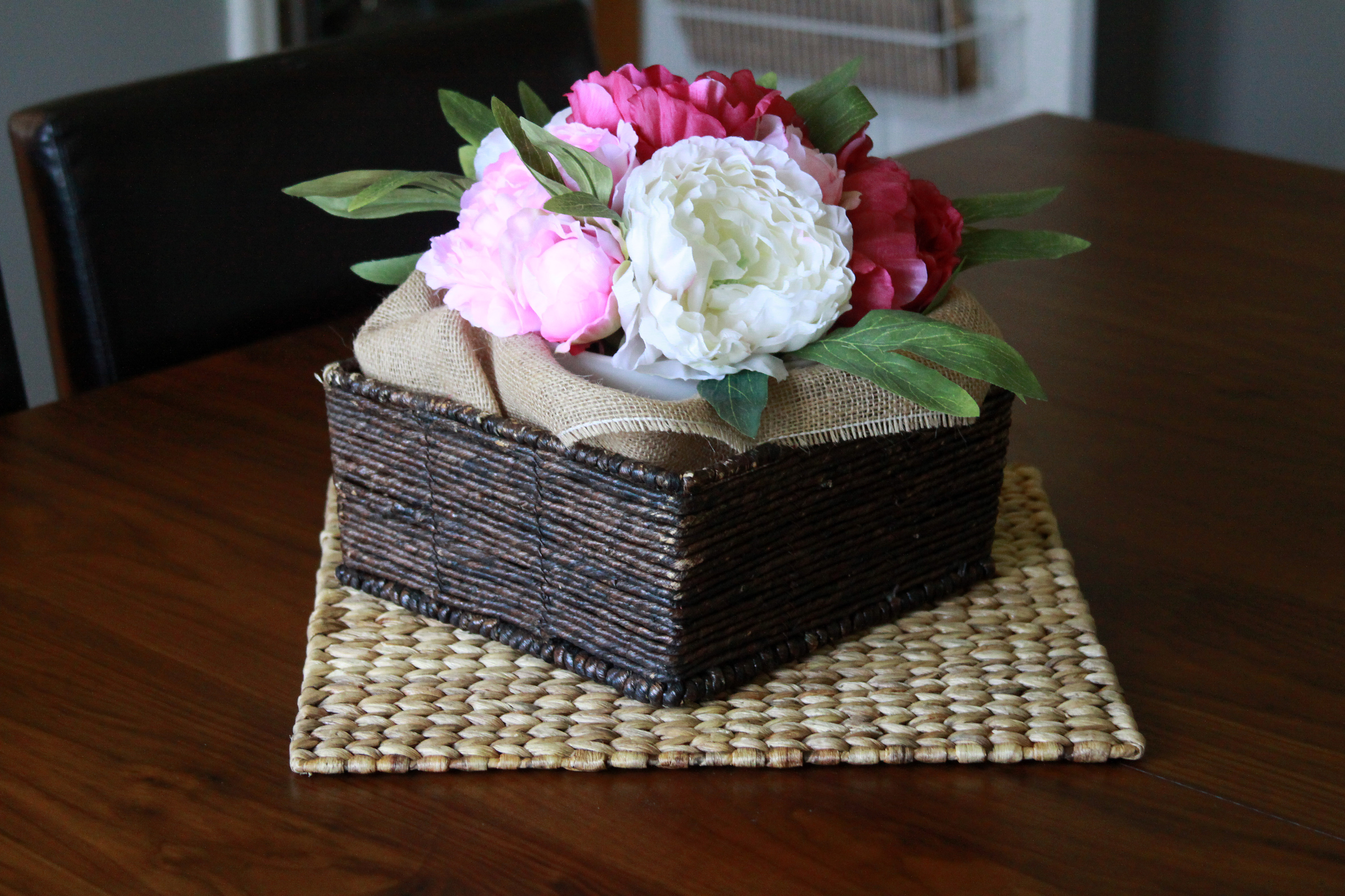
Today I’m excited to take you on a little tour of our dining room, also known as my favorite room in the house. It’s not the room we spend the most time in,
but it’s certainly my favorite. The way the colors came together and the little details, it all just works.
This room is technically a bedroom. When we purchased the home, it was decorated as a kid’s bedroom, and had two doors, one that opened to the kitchen and the other to the hallway.
It was a little strange to have a bedroom (that we didn’t need) that opened into the kitchen, so when we moved in we took the door off the hinges between the bedroom and kitchen
and turned it into a dining room. It’s been a great place to entertain friends and familyand I couldn’t imagine our house without it!
Though I suppose when we have more than one kid, we might need to think about turning it back into
a bedroom. Here’s a little look at my favorite room in the house:
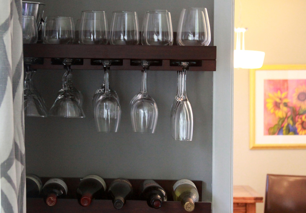
Our wine glasses and bottles were stored away in the cabinet in our previous apartment. This wine rack from Pottery Barn fit perfectly
into the corner of our dining room and gives us a place to display some of our favorite bottles of wine.
Although we bought our wine rack at Pottery Barn, we recently discovered you can also buy a very similar model at Costco for much cheaper!
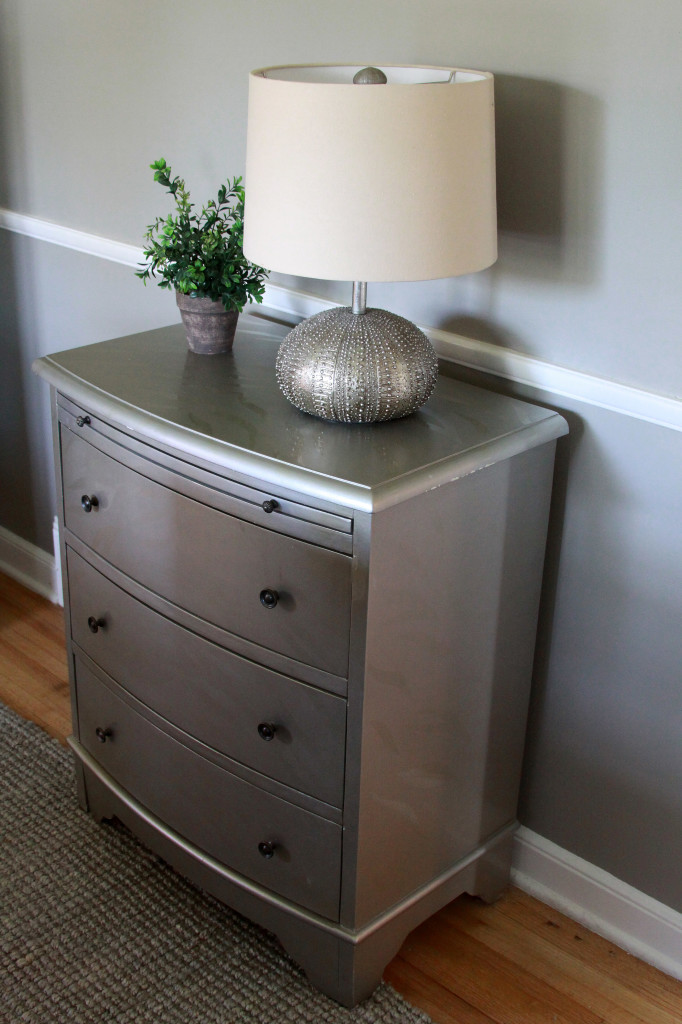
If I had to pick one picture that sums up my decorating style, this would be it. The silver table (which I’ve had forever and was purchased at a second hand store, I believe)
is classic with a little hit of something special. We currently have it filled with odds and ends for entertaining, like paper napkins, place mats and the like.
The wall color we chose is Benjamin Moore Rockport Grey; I couldn’t be more trilled with the results. It’s warm enough to feel cozy instead of cold.
The rug was newly purchased from West Elm.
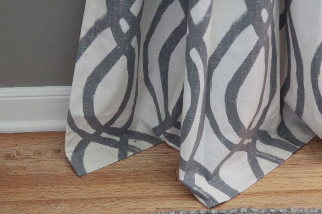
The drapes are also from West Elm. Instead of putting the rod right above the windows, we installed the rod as close to the ceiling as possible, leaving a little bit of excess at the bottom,
to give the room a taller and more dramatic feel.
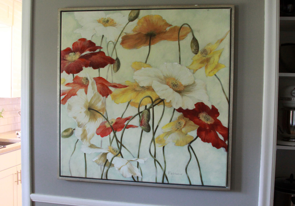
This painting, which my mom found at HomeGoods last year, is my favorite piece of artwork in the house.
And it happens to fit perfectly between the doorway (to the kitchen) and the pantry.
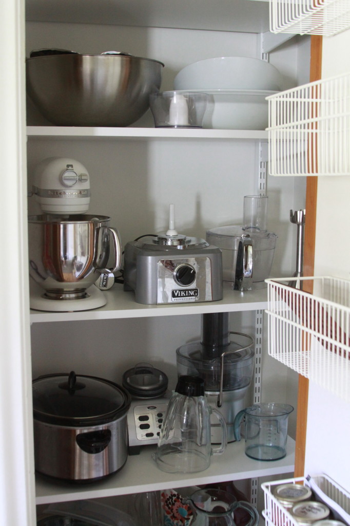
Since the dining room is technically a bedroom (and was used that way when we bought the house), we had a decent-sized closet to work with.
Since we didn’t need the closet to store clothing, we installed closet organization systems from The Container Store so I could store some of my larger
kitchen appliances. We are short on pantry space in our kitchen, so this was a real lifesaver.
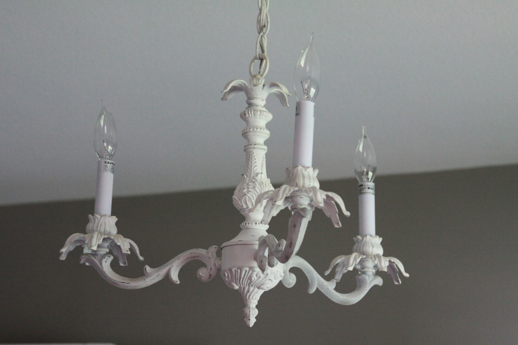
And finally, the light fixture. When we first saw the room, it was decorated with bright green paint and was fashioned as a kid’s bedroom.
The light fixture (which appears to be original to this 1952 house) was on my hit list of things I had to remove asap! But, once we painted
the room grey, the light figure really grew on me. In fact, I would dare to say that I love it now. Since unique and quirky antiques are
in style these days, it seems ashamed to get rid of such a fun and different addition to the room.
And that’s that! Thanks for taking a tour with me. Up next week? Our master bedroom.
Madison

