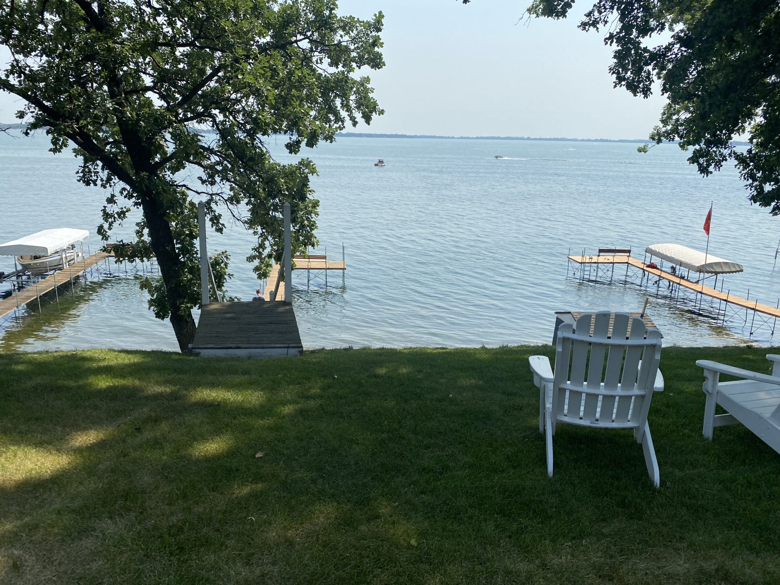
It’s pretty much the perfect spot to make family memories.
Our lake house is DONE! Well, the inside is done. The outside still has plenty of projects to keep us busy over the next few years, but it’s nice to have the inside complete in time for summertime. We have already put the lake house to use many weekends this summer and we look forward to finding many ways to use this house in the many years to come.
The theme for this house was light + bright with plenty of touches of blues, golds and wood throughout. We wanted to keep the charm and feel of our 1950’s-style house (think: amazing original hardwoods, great lake view, quaint little layout, lots of charm) but update it a LOT. I wasn’t prepared for the scale of our renovation. I had seen it on paper, but it wasn’t until I visited the house during reno that I realized we were pretty much starting from scratch in many ways.
A HUGE thanks to the ultra-talented Kristin Mellema of Align Creative Design who took our little house and transformed the layout into something truly special. And to Joel Jongerius of Joel Jongerius Construction who does the most flawless work around.
Let’s take a little tour, shall we?
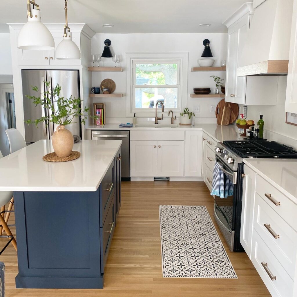
The Kitchen
I was heavily inspired by this kitchen when deciding on finishes and colors for our lake house kitchen. The hardware is Emtek Freestone. The kitchen cabinets are a white custom color from our cabinet maker – Verhoef Custom Woodworking. The island color is a color match to Benjamin Moore Hale Navy. The white walls and white woodwork throughout the house are Benjamin Moore White Dove. The kitchen faucet and RO faucet are Brizo.
Our countertops are Cambria “Smithfield” which is a newer one of their countertops and I LOVE how clean and bright the white countertops look. Instead of doing a traditional backsplash with tile, I opted to simply have a 4-inch strip of our countertop along the wall. It saved us money (tile backsplashes can be pricey!) but also, for me, gave me more practical functionality. I didn’t want to be worried about myself or others having food splash up on the grout – which then becomes a burden to clean.
The pendants are from Restoration Hardware; I went back and forth on pendants forever but these are absolutely perfect in the space! The floors throughout much of the house were in decent shape (original hardwoods) so we had them refinished and had them lay wood to match the original hardwoods in the kitchen – which was formerly laminate. The end result is a mix of white and red oak, which is what was laid throughout the rest of the upstairs.
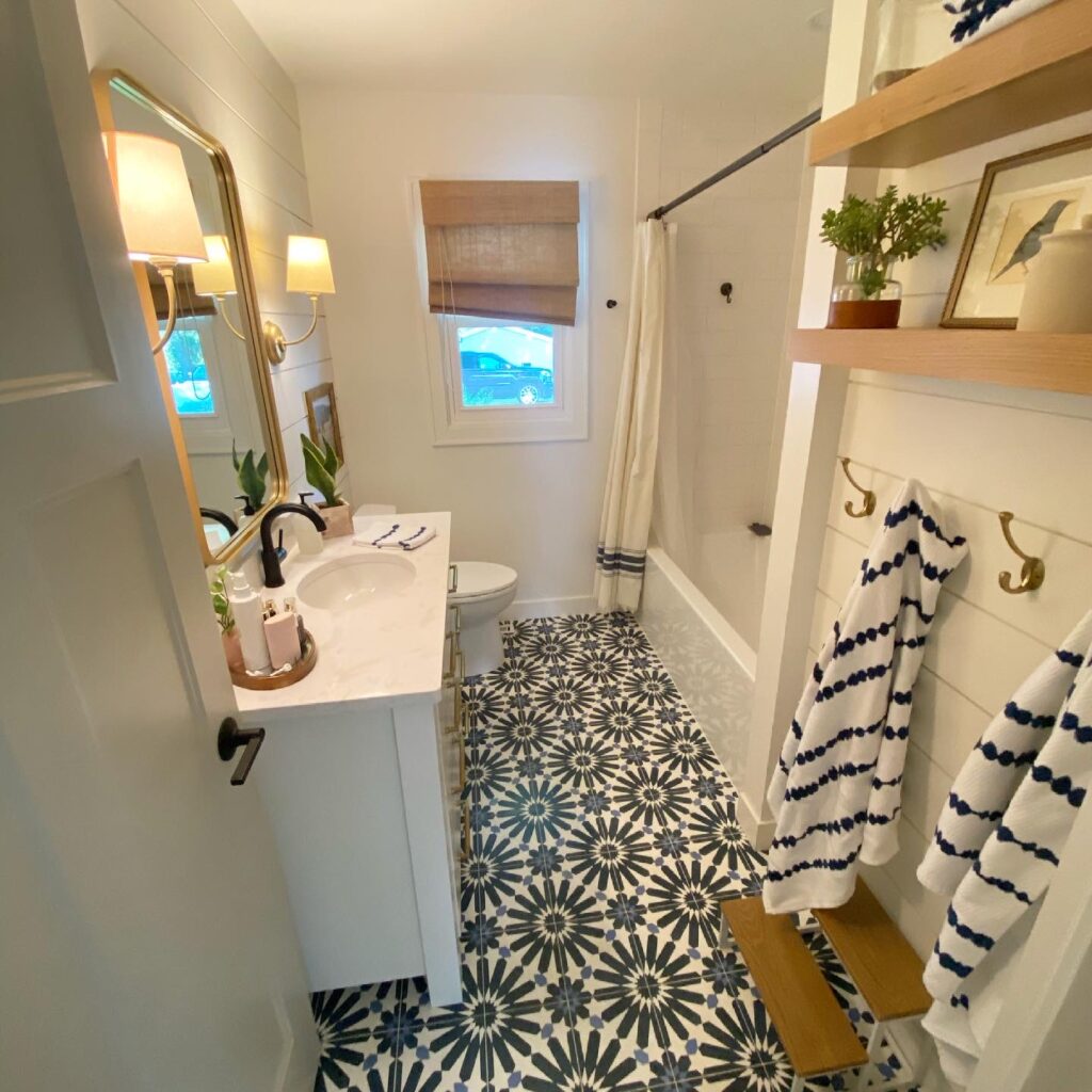
Upstairs Bathroom
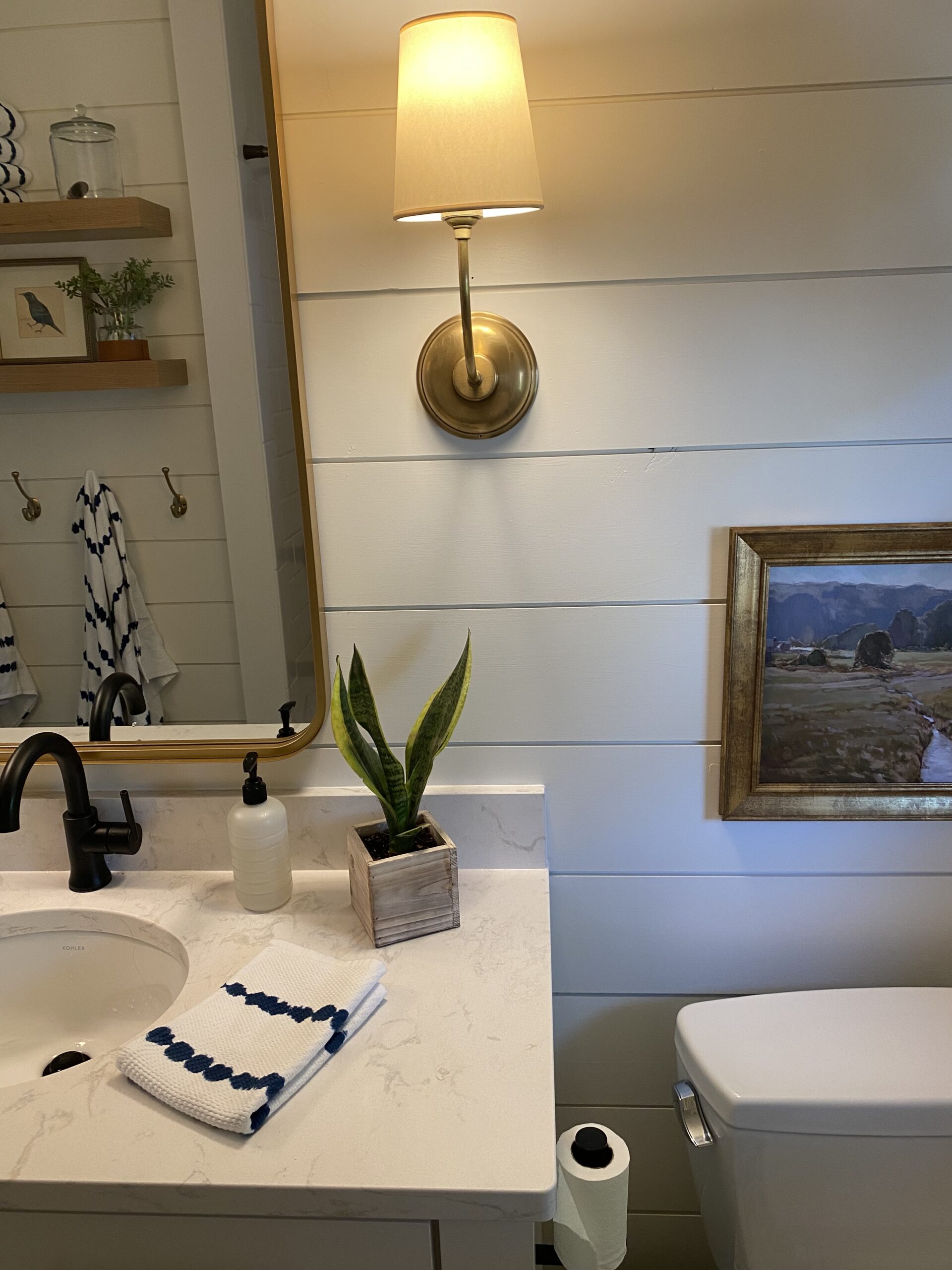
My favorite room in the entire house! I LOVE how this came together. The bathroom itself is small, but with some smart design and great cabinet work, it doesn’t feel cramped at all. Again, the cabinets are custom from Verhoef Custom Woodworking with a custom white. The countertops are Cambria “Ella” countertops which have a bit more variation than our kitchen countertops.
The flooring was the boldest choice for me – but I was set on the idea of cement tiles. These are Cle “Big Al” in federal blue. The overall look is exactly what I was going for. The mirror is from Studio McGee for Target and the sconces are Thomas O’Brien.
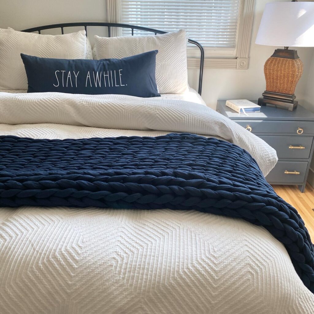
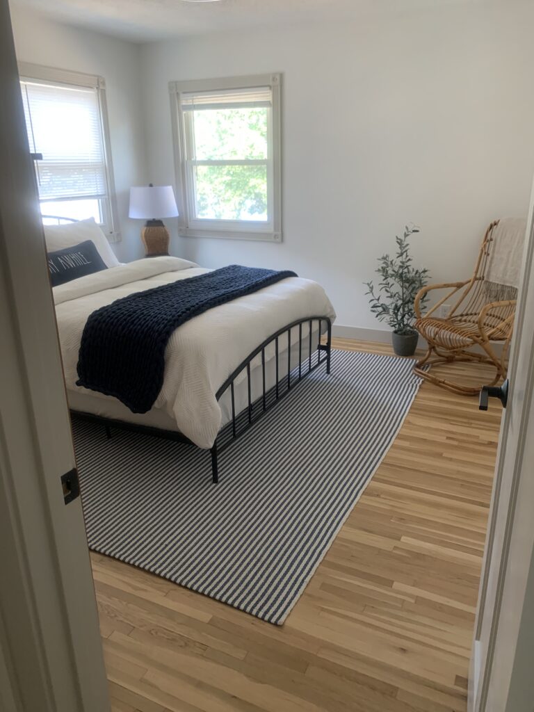
Master Bedroom
We kept the original hardwoods and had them refinished, then added a new light and new paint. We found these cute little side tables at a second hand store and had them painted (Hale Navy by Benjamin Moore) and found some other second hand pieces like a painting, a dresser from Joe’s grandma and a lamp.
We plan to eventually replace some of the windows in the bedrooms when we put new siding on the house a few years from now, so we opted to keep the existing trim around the windows for now and painted it Revere Pewter from Benjamin Moore. Upstairs, there is contrast trim in the bedrooms and doors plus the upstairs hallway. I love the look a bit of contrast trim adds to these rooms, which are otherwise quite simple and small.
The bed frame is from Overstock and I am super pleased with the quality relative to the price! The bedding is old that we re-purposed from home and I couldn’t go without my favorite weighted blanket – so I had to buy one for the lake, too.
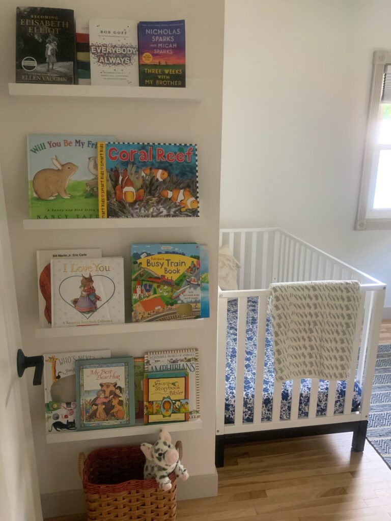
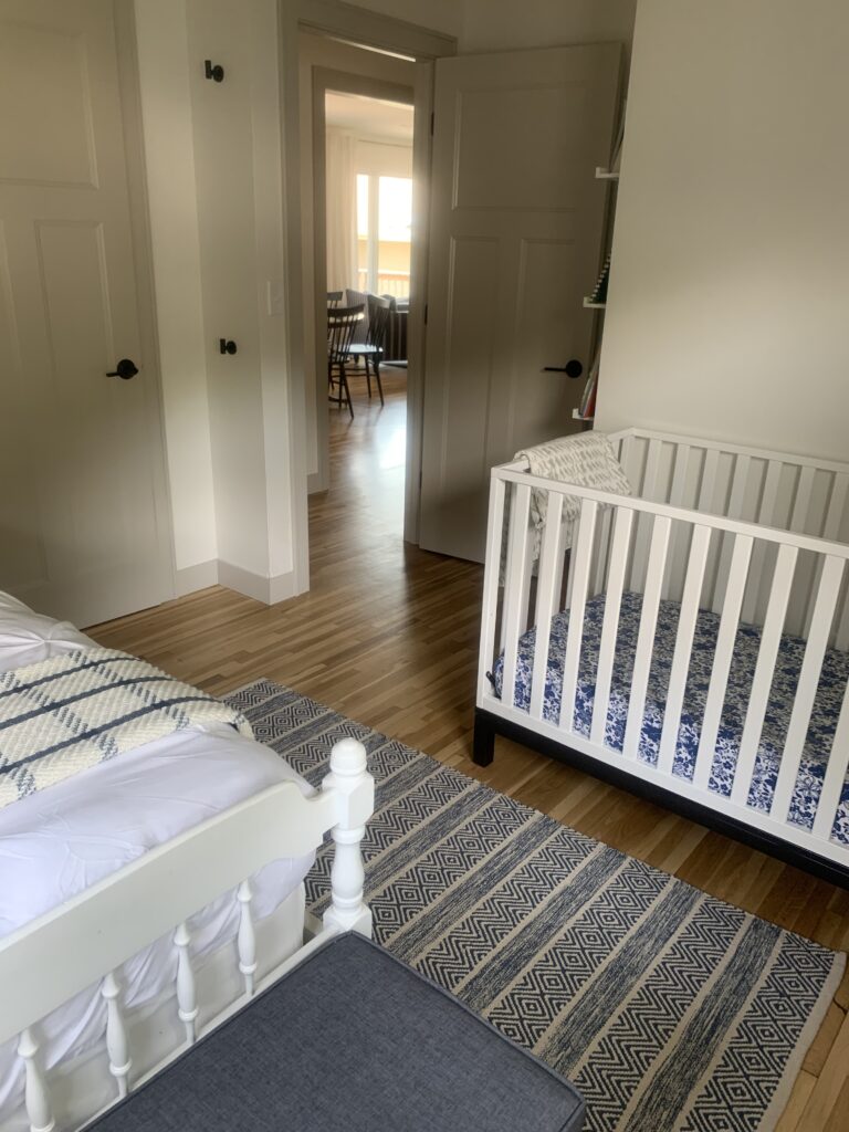
Kids Bedroom (upstairs)
Another small bedroom (hello, 50’s house!) which we decided to fill with a twins bedroom and a crib for Truett. While we do have a pack and play at the lake, I am thankful to have a place that feels like “home” for Truett. After a couple weeks of rough sleep, I’m happy to report Truett now sleeps great at the lake house.
The bed is a vintage bed that used to belong to my aunt (I slept in it as a child, too) and the crib was from All Modern years ago. The shelves are from Ikea.
Bunk Room
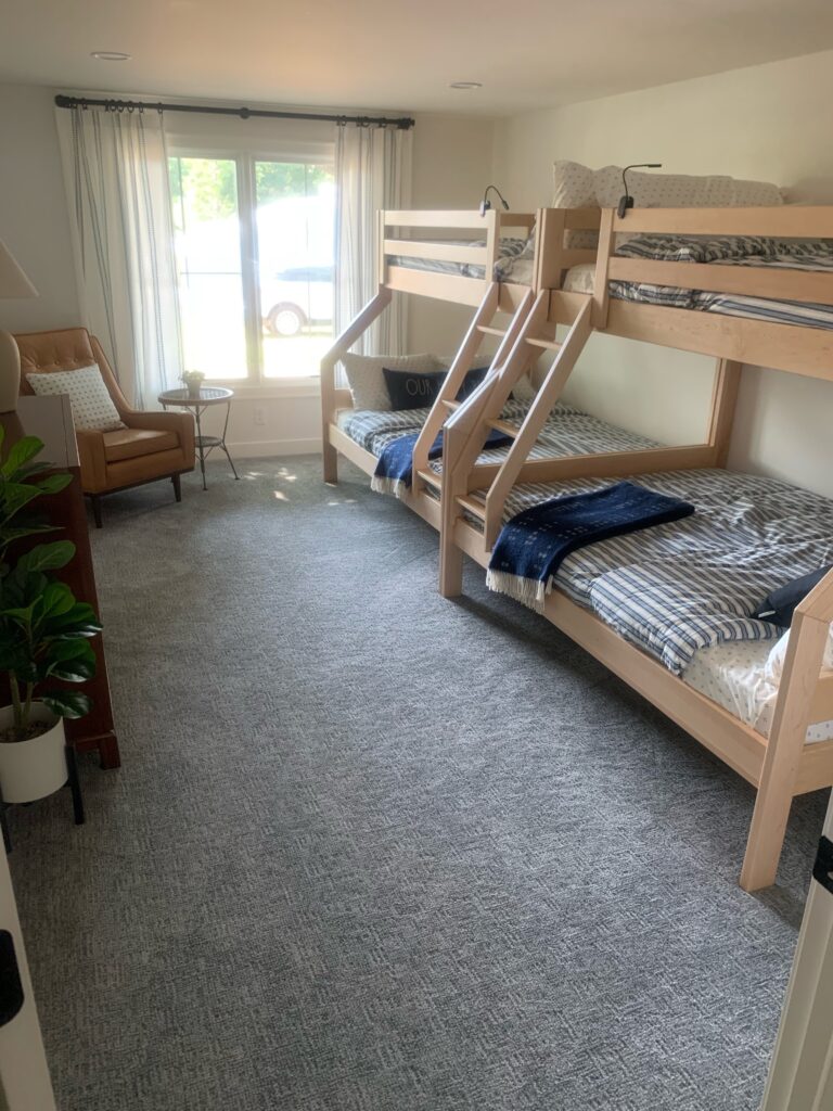
When we first toured the house, it didn’t take long for us to catch a vision on what to do with the run-down single car attached garage. Our primary concern with a lake house was beds for sleeping/housing friends and family. Our goal was to be able to comfortably sleep at least our family and one or two others. A bunk room was high on my bucket list.
We now have two sets of bunk beds in the bunk room with full on the bottom and twin on top. These bunk beds also have a trundle option, though I doubt we will ever actually get + use them But it’s nice to have the option! The bedding is from L.L. Bean. I had NO idea they had bedding but my mom found these great comforters and I’m in love.
The bunks are from Room and Board – the Waverly twin over full. They are low profile (great for lower ceiling heights) and sturdy + well made. The bedding is from Target and the chair is from Article. The dresser opposite the beds is from a local second hand store.
Downstairs Bathroom
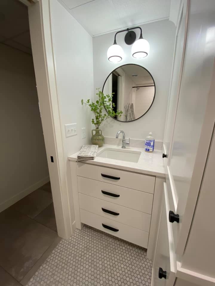
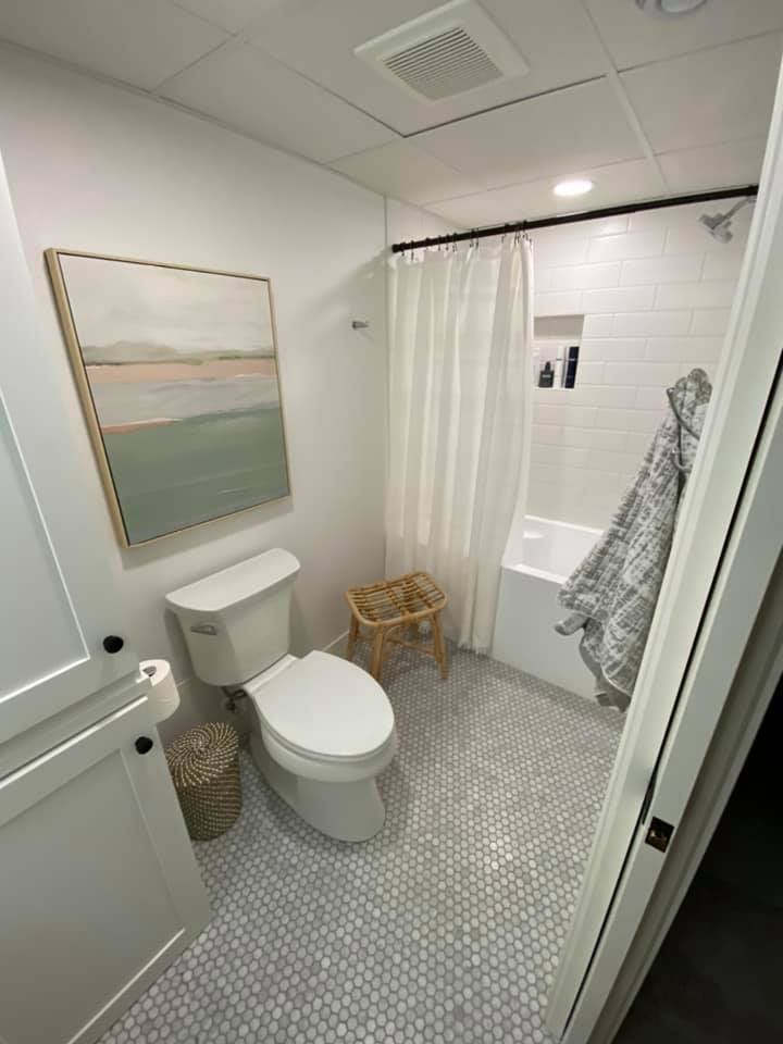
This bathroom is in the walk-out basement and has a narrow floor plan, but I was thrilled to still manage to get a full bathroom downstairs. There is a tub (it’s shorter than standard but deeper than standard, too) and shower combo along with plenty of cabinet space. We were forced into the cabinets to cover some piping, but it was a blessing to have so much storage in the bathroom! We store cleaning supplies, bathroom towels, beach towels and extra toiletries in these cabinets. Our countertops are Cambria “Delgatie.”
For added brightness in a bathroom without any windows, we used Benjamin Moore Decorator’s White. The tile is Cle Carrera Hex. The mirror is from Rejuvenation. The artwork is from Target as is the wastebasket.
Downstairs Bedroom
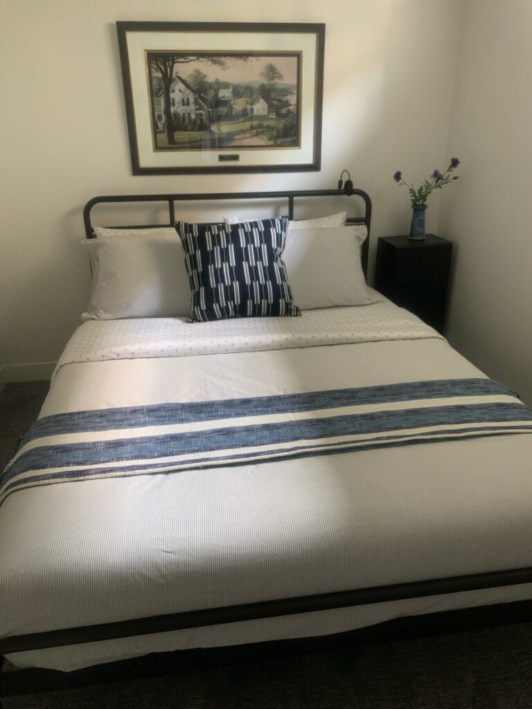
The bedroom downstairs is currently non-conforming (aka we need to put an egress window in, which we plan to do down the road.) It was in really rough shape when we first took possession (are you sensing a theme here?) and it’s current shape is a huge improvement.
It’s a small room, so it fits a queen bed and a small night stand and that’s about it! Instead of placing doors on the closet, we opted for a blue and white striped curtain instead to save space and money.
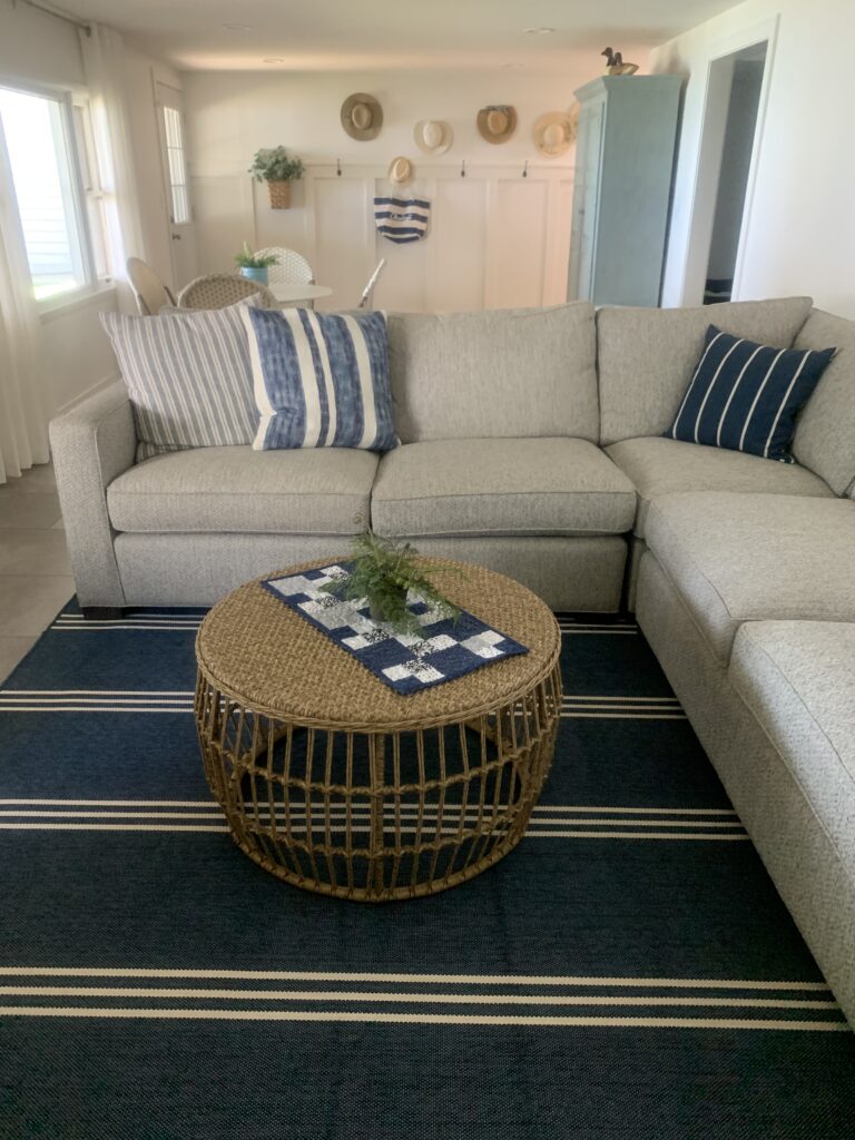
Downstairs Living Area
One big draw of the house was the fact that the basement is a walk-out, meaning lots of natural light which makes the basement feel less like a basement and more like an extension of the rest of the house.
The couch is the Room and Board Morrison Sectional (that we scored at the Room and Board outlet!) and the blue dresser piece was re-painted by my mom and gifted to us by a friend. The rug is an indoor/outdoor rug from Target that works well for the durability needed in this space.
The coffee table is from Kirkland’s. I couldn’t find the exact link, but it’s worth searching online to see if you can find it!
And that’s about it! If you have questions about anything that I haven’t linked or sourced, let me know in the comments below and I’ll do my best to track down a link.
Madison
